By Andre / March 29, 2026
I Owe GIMP an Apology. It's Me, Not You
In a recent episode, I went kind of hard on GIMP. I said it was ugly. That was on me, so I’m going to reel it back in. I’ve used GIMP since the late 90s, and the UI never really bothered me until recently. But there is a way around it. First, let’s talk about how we got here.
It Started With a Video
It’s Affinity’s fault. Look, I am not a graphic designer, but there are times I need to design something. Sometimes the only template available has a “Smart Object,” which GIMP does not support. That’s where Affinity came in.
A couple of years ago, I found myself in that spot. I’m not a fan of Adobe, and a web option like Photopea was out of the question since I try to avoid web apps when possible. So I started looking for alternatives and found Affinity. I bought the entire v1 suite and later upgraded to v2. It’s fast, it looks good, and the perpetual license was a huge selling point. Then last year, Canva purchased Serif.
I don’t find anything interesting about Canva, and honestly, I don’t believe it will be free forever. So I decided not to wait for the other shoe to drop. I still have v2 installed and plan on migrating production work elsewhere. I just haven’t had the time yet. Throughout all of this, I kept Inkscape, GIMP, and Scribus ready to go. My plan was to start new projects with my old tools. Then I needed to make a video.
Chris handles audio and video production for our podcast, but there have been a couple of times where I stepped in. We use DaVinci Resolve, and while it’s great, what takes Chris a fraction of the time takes me forever. So I explored other options and ended up buying Final Cut Pro.
The UI Means More Than You Think
Using Final Cut Pro, I finished a video in way less time than it would have taken me in DaVinci.That felt good, but it also made me stop and ask why. The mechanics are similar, but the experience is not.
One tool exposes everything at once. The other surfaces what you actually need for the task. That difference is the UI. So what does this have to do with GIMP? I tend to use software as it comes out of the box, and stock GIMP is not user-friendly. It’s overwhelming. And yeah, it’s ugly.
I’ve used GIMP for decades and never thought twice about it, but after that realization, I wanted to understand why it suddenly bothered me.
I Have Been Buying a Lot of Software Recently
Over the past year, I’ve bought a lot of software for my company. One thing stood out across almost all of it: good tools invest heavily in UI. I picked up Apple Motion, Pixelmator Pro, Photomator, and a few others. Over 90% of them just look good. Damn good.
As a developer, that made me more critical of my own work and everything else I use. GIMP caught that criticism. Opening it made me feel like it wasn’t “professional,” but that wasn’t true. The problem wasn’t the capability, it was the presentation.
PhotoGIMP tries to fix this by mimicking Photoshop, but I haven’t used Photoshop since the 90s. That doesn’t solve my problem. I want to stick with stock tools and make them work for me.
I Can Just Change the UI
So this week I opened Affinity Photo for shits and giggles and started rearranging things in GIMP.
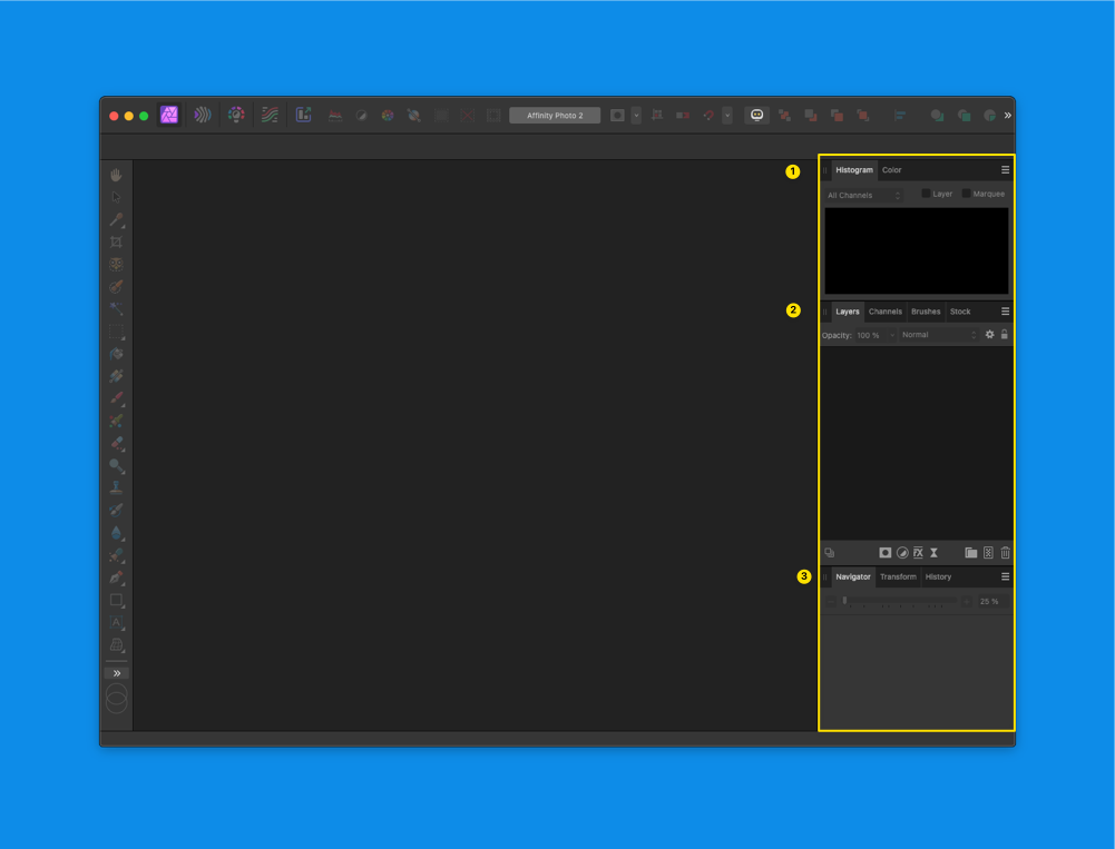
Affinity Photo v2 UI
Here is Affinity’s layout:
- Top
- Histogram
- Color
- Middle
- Layers
- Channels
- Brushes
- Stock
- Bottom
- Navigator
- Transform
- History
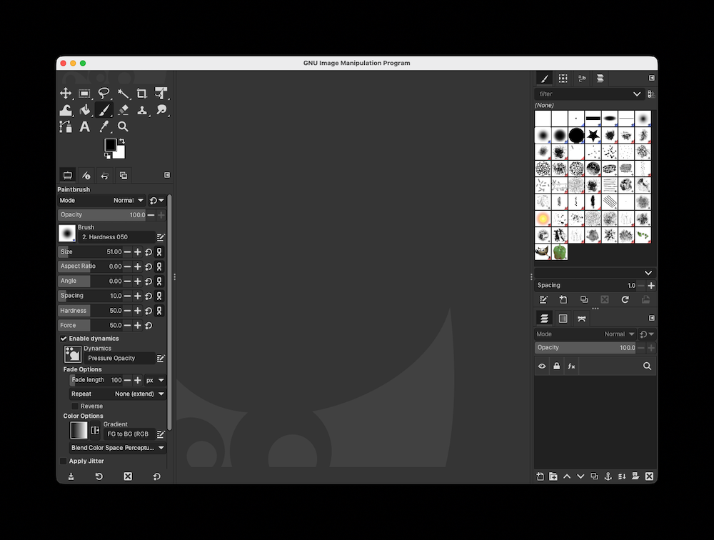
GIMP layout after changes
Here’s how I structured GIMP:
- Top
- Tool Options
- Histogram
- FG/BG Color
- Palettes
- Middle
- Layers
- Channels
- Brushes
- Bottom
- Navigator
- History
I didn’t touch the keybindings. Those are locked in from years of muscle memory.
And that was it.
GIMP wasn’t the issue. I was.
The solution had been sitting there the whole time: change the layout.
I Want Open-Source Projects to Succeed
GIMP isn’t hard to use. The default layout just gets in the way.
If the teams behind GIMP and Inkscape took a closer look at how modern tools present information and made the default layout more familiar, adoption would improve overnight.
And then remind users they can customize everything anyway.
That’s the real strength of tools like this.
